

Why Mobile-First Design Suits Pregnancy Platforms

Índice
- Why mobile-first design suits pregnancy platforms: usability and engagement
- How does mobile-first design support emotional well-being in pregnancy apps?
- What are the technical advantages of mobile-first design for pregnancy apps?
- How do designers balance complexity and simplicity in pregnancy interfaces?
- Key Takeaways
- My take on mobile-first as the non-negotiable standard for maternal health tech
- Boy or Girl’s mobile-first tools for expectant parents
-
FAQ
- Why does mobile-first design matter for pregnancy platforms?
- What is progressive disclosure in pregnancy app design?
- How does mobile-first design improve trust in pregnancy apps?
- What touch target size is required for pregnancy app usability?
- Can mobile-first design help with HIPAA and GDPR compliance?
- Recommended
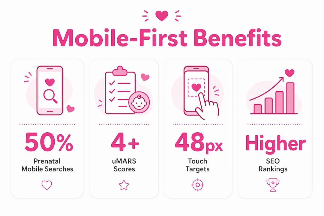
Mobile-first design is defined as the practice of building digital experiences for mobile devices before scaling up to desktop. This approach directly answers why mobile-first design suits pregnancy platforms: more than 50% of healthcare and prenatal searches originate from mobile devices. Expectant parents reach for their phones first, whether they are tracking a symptom at 2:00 AM or checking a nutrition tip between appointments. Pregnancy platforms carry a unique emotional weight that desktop-heavy designs simply cannot support. The mobile-first approach, also called progressive enhancement in reverse, meets parents exactly where they are.
Why mobile-first design suits pregnancy platforms: usability and engagement
Pregnancy platforms built mobile-first deliver measurably better usability. The evidence is direct: a maternity app redesign using mobile-first principles produced a 400% increase in downloads. That result reflects what happens when an interface stops fighting the device and starts working with it.
The core usability gains come from specific design decisions:
- One-handed operation. Expectant mothers often hold a phone in one hand while managing daily tasks. Touch targets of 48 pixels or wider meet the standard for comfortable one-handed use. Smaller targets cause errors and frustration.
- Simplified navigation. Mobile screens force designers to prioritize. Only the most critical features survive the small-screen constraint, which means parents find what they need faster.
- Touch-friendly controls. Swipe gestures, large buttons, and bottom-anchored navigation bars reduce the physical effort of using an app during a tiring trimester.
- Wellness-first visual design. Soft color palettes and low-density layouts reduce cognitive load. A cluttered screen raises stress; a calm screen builds confidence.
Pregnancy apps that prioritize mobile design also earn stronger usability scores. Research shows a mean uMARS score of 4.2 out of 5 for pregnancy apps built with mobile-optimized interfaces. That score reflects genuine user satisfaction, not just technical compliance.
Pro Tip: Test every core user flow with one hand on a physical device, not just in a browser emulator. Real-world grip patterns reveal navigation problems that desktop testing misses entirely.

How does mobile-first design support emotional well-being in pregnancy apps?
Trust in a pregnancy app is not a feature you add at the end. Trust must be built into design from the start through color choices, navigation clarity, and data protection practices. Expectant parents share deeply personal health data. If the interface feels confusing or unsafe, they leave.
Mobile-first design enforces the kind of simplicity that reduces anxiety. Clear navigation paths, minimal form fields, and obvious privacy controls all signal that the platform respects the user. These are not aesthetic choices. They are functional trust signals.
“Mobile applications increase prenatal attachment by enabling real-time interaction and daily updates. Platforms that deliver timely, personalized content through mobile-optimized interfaces strengthen the emotional bond between parents and their pregnancy experience.”
Role-based notifications take this further. Sending different alerts to the mother versus the partner acknowledges that both people are emotionally invested. A notification reminding the partner to attend an upcoming scan feels supportive. The same generic alert sent to both feels impersonal. Personalization at this level requires a mobile-first architecture that treats context as a design input, not an afterthought.
Designing for both parents also improves relational dynamics throughout the pregnancy. When a platform acknowledges the partner’s role, it builds a stronger support network around the expectant mother.
Pro Tip: Use privacy-by-design principles from the first sprint. Store sensitive data locally where possible, and make data-sharing controls visible and easy to adjust. Parents notice when a platform treats their information carefully.
What are the technical advantages of mobile-first design for pregnancy apps?
Mobile-first architecture produces faster, lighter, and more reliable pregnancy platforms. The technical gains are concrete and measurable.
- Faster load times. Responsive images with
srcsetattributes and lazy loading of media like ultrasound gallery images can cut initial page weight by up to 50%. A faster page keeps parents engaged instead of waiting. - Accessible touch targets. The 48-pixel minimum for touch targets is not just a usability preference. It aligns with WCAG accessibility standards, which benefit all users, including those with motor challenges during late pregnancy.
- Offline tracking. Mobile-first apps can store symptom logs and kick counts locally, then sync when connectivity returns. This matters in areas with unreliable data coverage, which is common during travel or rural prenatal visits.
- Compliance by design. HIPAA and GDPR requirements map naturally onto mobile-first architectures. Local data storage, encrypted sync, and granular permission controls are easier to implement when privacy is a design constraint from day one, not a retrofit.
| Technical feature | Mobile-first benefit |
|---|---|
| Responsive images with srcset | Serves device-appropriate assets, reducing data use |
| Lazy loading of media | Cuts initial load weight by up to 50% |
| Local data storage | Enables offline tracking and improves privacy |
| 48px touch targets | Meets WCAG standards and one-handed usability |
| Permission-based data sync | Supports HIPAA and GDPR compliance by default |
Healthcare SEO also benefits from mobile-first builds. Mobile-optimized healthcare platforms rank higher in search results because Google’s indexing is mobile-first. A pregnancy platform that loads fast on a phone earns better organic visibility, which means more expectant parents find it when they need it.
How do designers balance complexity and simplicity in pregnancy interfaces?
Pregnancy platforms face a genuine tension. Clinicians want complete data. Parents want clarity. Mobile-first design resolves this through progressive disclosure, a technique that surfaces only the most relevant information first and reveals deeper detail on demand.
Accordion menus and layered interfaces work well here. A symptom tracker might show a simple daily check-in by default, with a “learn more” option that opens clinical detail. This structure respects the parent who wants a quick log and the parent who wants to understand the medical context. Both needs are met without cluttering the primary screen.
| Design approach | Desktop-first result | Mobile-first result |
|---|---|---|
| Information density | High, often overwhelming | Progressive, revealed on demand |
| Navigation depth | Deep menus, hidden options | Flat structure, visible priorities |
| Onboarding flow | Feature-heavy from the start | Wellness-first, realistic goal setting |
| Text size | Often too small on mobile | Legible by default, no pinching required |
Pregnant users consistently prefer clarity over clinical complexity. That preference is not a limitation. It is a design signal. Platforms that honor it through minimalism and progressive disclosure retain users longer and generate more consistent engagement.
Wellness-first onboarding flows also prevent early dropout. Setting realistic health goals during setup, rather than presenting every feature at once, gives parents a sense of progress from the first session. That early win builds the habit of returning to the platform daily.
Key Takeaways
Mobile-first design is the foundational approach for pregnancy platforms because it aligns with how expectant parents actually use technology, under physical, emotional, and time constraints that desktop-first designs ignore.
| Point | Details |
|---|---|
| Mobile behavior drives design | Over 50% of prenatal searches are mobile-originated, making mobile-first a baseline requirement. |
| Usability gains are measurable | Mobile-first redesigns have produced a 400% increase in app downloads in documented maternity cases. |
| Trust requires intentional design | Privacy controls, clear navigation, and soft visual design must be built in from the first sprint. |
| Performance is a clinical concern | Lazy loading and responsive images cut load times by up to 50%, keeping time-sensitive content accessible. |
| Progressive disclosure resolves complexity | Layered interfaces let parents access clinical depth without cognitive overload on small screens. |
My take on mobile-first as the non-negotiable standard for maternal health tech
At Boy or Girl, we have watched pregnancy platforms struggle when they treat mobile as a secondary concern. The pattern is consistent: a desktop-first build gets a responsive skin applied late in development, and the result feels exactly like what it is. Parents sense the friction immediately.
What the research confirms, and what we see in practice, is that mobile-first is not a design preference. It is a clinical and emotional requirement. Expectant parents are managing physical discomfort, emotional intensity, and information overload simultaneously. A platform that adds to that load loses them. A platform that reduces it earns their loyalty.
The next frontier is AI-driven personalization within mobile-first frameworks. Platforms that can serve the right content at the right trimester, to the right parent, on the right device, will define the standard for maternal health tech in the years ahead. Privacy-first design frameworks will be the foundation that makes that personalization trustworthy. Fertility health resources, such as those covering sperm banking and fertility clinic integration, show how adjacent health platforms are already building this kind of connected, mobile-centered care. Pregnancy platforms should be leading that shift, not following it.
Boy or Girl’s mobile-first tools for expectant parents
Boy or Girl builds its pregnancy tools around the mobile-first principles this article covers. The XY Method app delivers chromosomal gender prediction through a clean, touch-optimized interface designed for use at any point in the day.
The Magic Voice feature offers an interactive, voice-driven pregnancy tracking experience built for mobile from the ground up. Both tools reflect the wellness-first design philosophy: minimal cognitive load, clear navigation, and personalized content for both parents. If you are building or evaluating a pregnancy platform, Boy or Girl’s approach shows what mobile-first design looks like when it is applied to real maternal health needs.
FAQ
Why does mobile-first design matter for pregnancy platforms?
More than 50% of prenatal searches happen on mobile devices. Designing for mobile first ensures the platform works best where expectant parents actually use it.
What is progressive disclosure in pregnancy app design?
Progressive disclosure is a technique that shows only the most relevant information first, revealing clinical detail on demand. It resolves the tension between medical completeness and user clarity on small screens.
How does mobile-first design improve trust in pregnancy apps?
Trust is built through design choices like visible privacy controls, clear navigation, and local data storage. Mobile-first architectures make these features easier to implement from the start.
What touch target size is required for pregnancy app usability?
Touch targets must be at least 48 pixels wide to support one-handed use and meet WCAG accessibility standards. This is especially important for parents managing a device while holding a newborn.
Can mobile-first design help with HIPAA and GDPR compliance?
Yes. Mobile-first architectures naturally support compliance by building permission-based data controls, local storage, and encrypted sync into the design from day one rather than adding them later.
Visita nuestras redes sociales
Recommended
Pregnancy Milestone Celebrations: Build Your Community

What Is a Pregnancy Wellness Platform? Your Guide

Mood Tracker for Pregnancy: Your 2026 Emotional Wellness Guide

Types of Pregnancy Online Communities: 2026 Guide

Top 6 Communities for promom.ai alternatives 2026

Pregnancy Milestone Checklist by Trimester: Full Guide